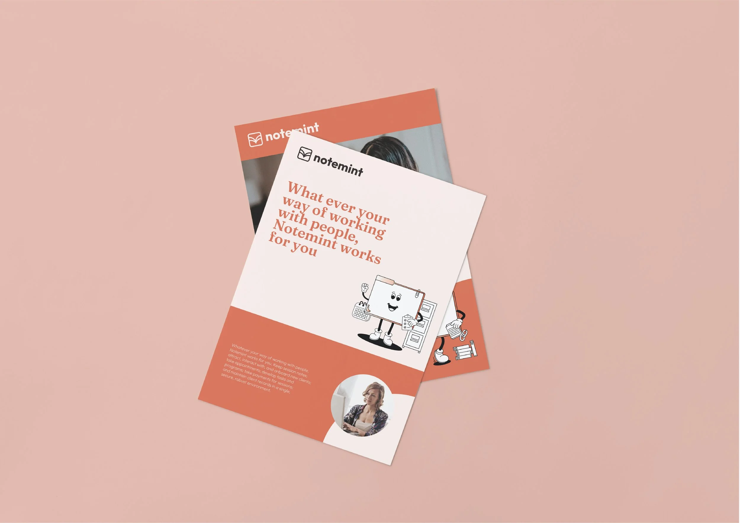
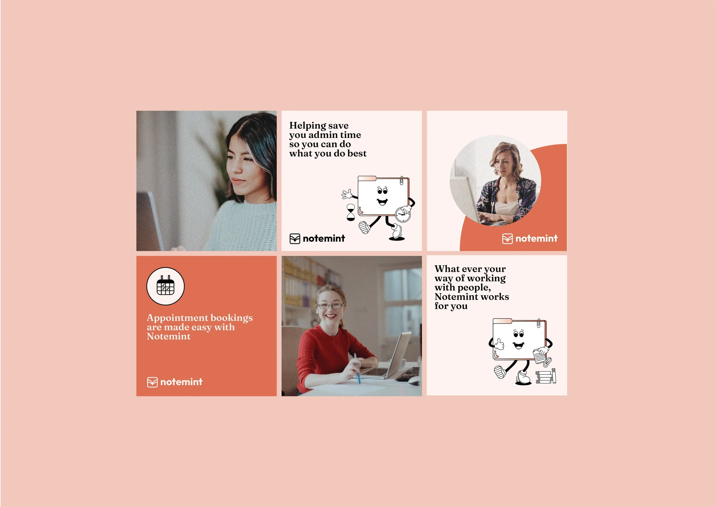
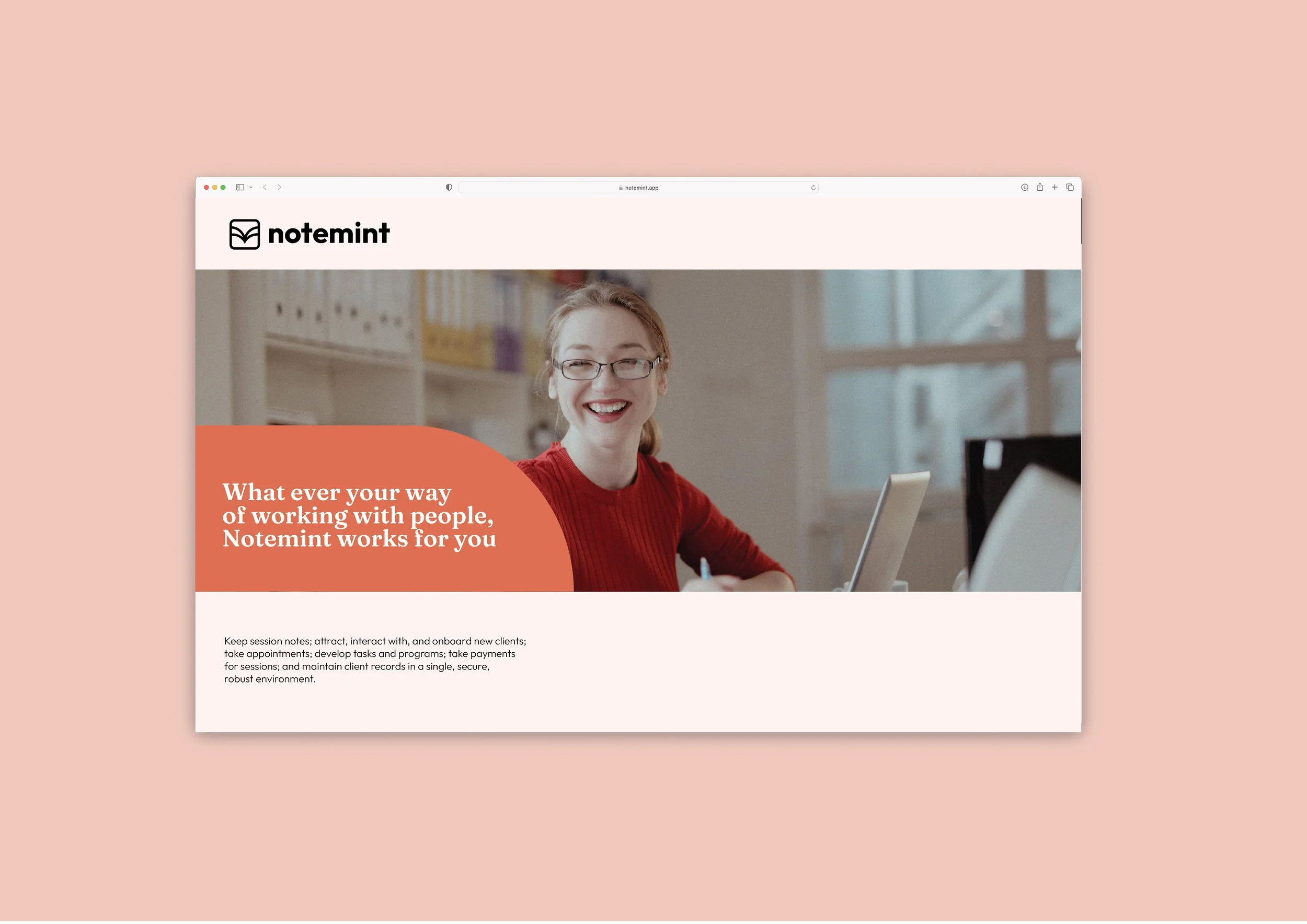
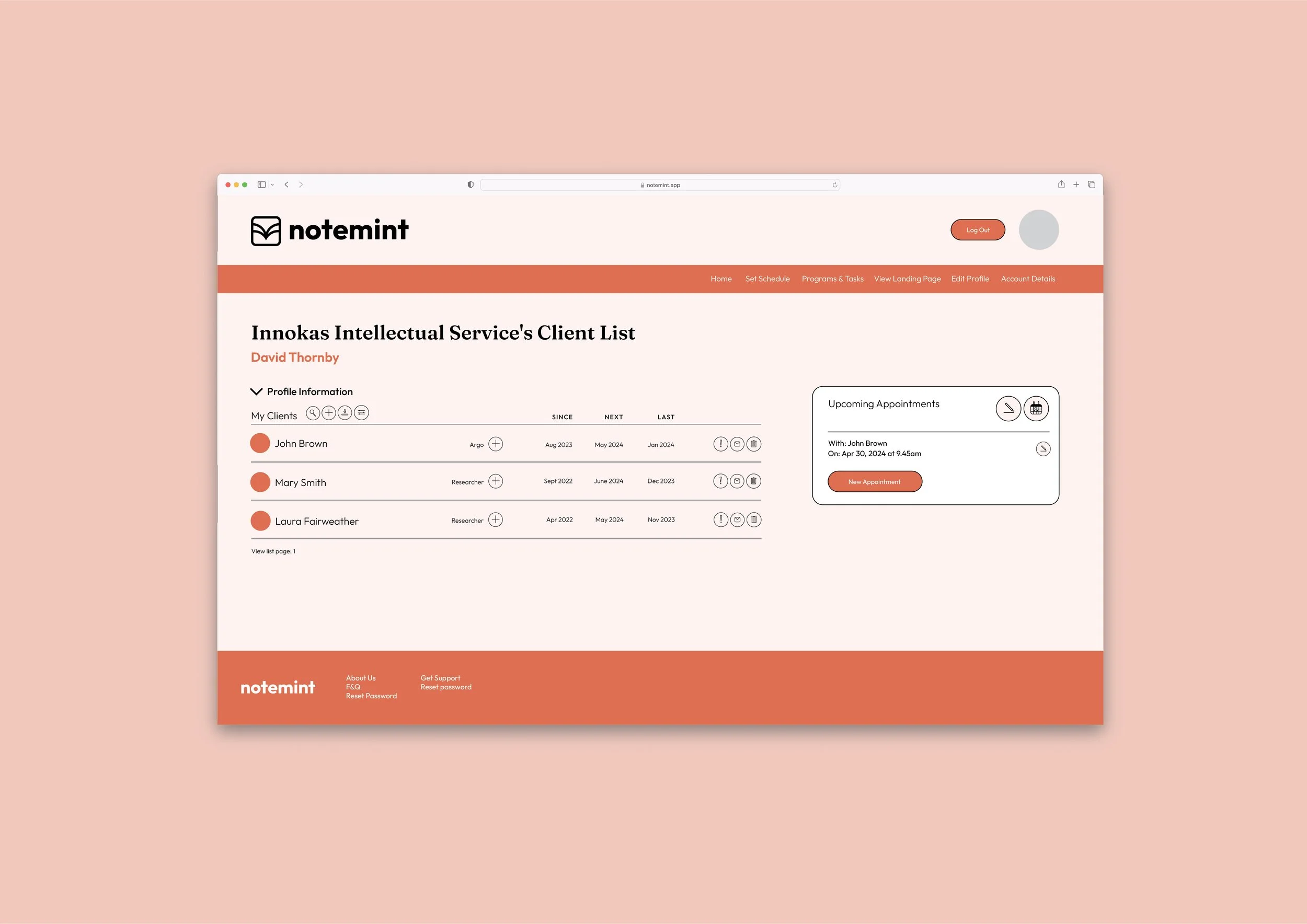
I was engaged by Notemint to create a brand refresh that aligned more closely with their product and clients. Notemint is an online system that simplifies all the functions of a sole practitioner. From massage therapists, music teachers, personal trainers and coaches to counsellors and anywhere in between, Notemint helps take appointments, keep session notes, take payments and maintain client records all in one secure environment. The brief was to create a new brand that reflected the simplicity of Notemint with a vintage twist. The new icon developed centres around what note mint is - bringing all files, notes ect into one simple place. The form of the icon creates an arrow within an app like square creating a simple icon device that could be used across the brand. As part of the brand design a set of icons and website styles were created to ensure the overall look and feel of the brand was maintained in its most important form - online.
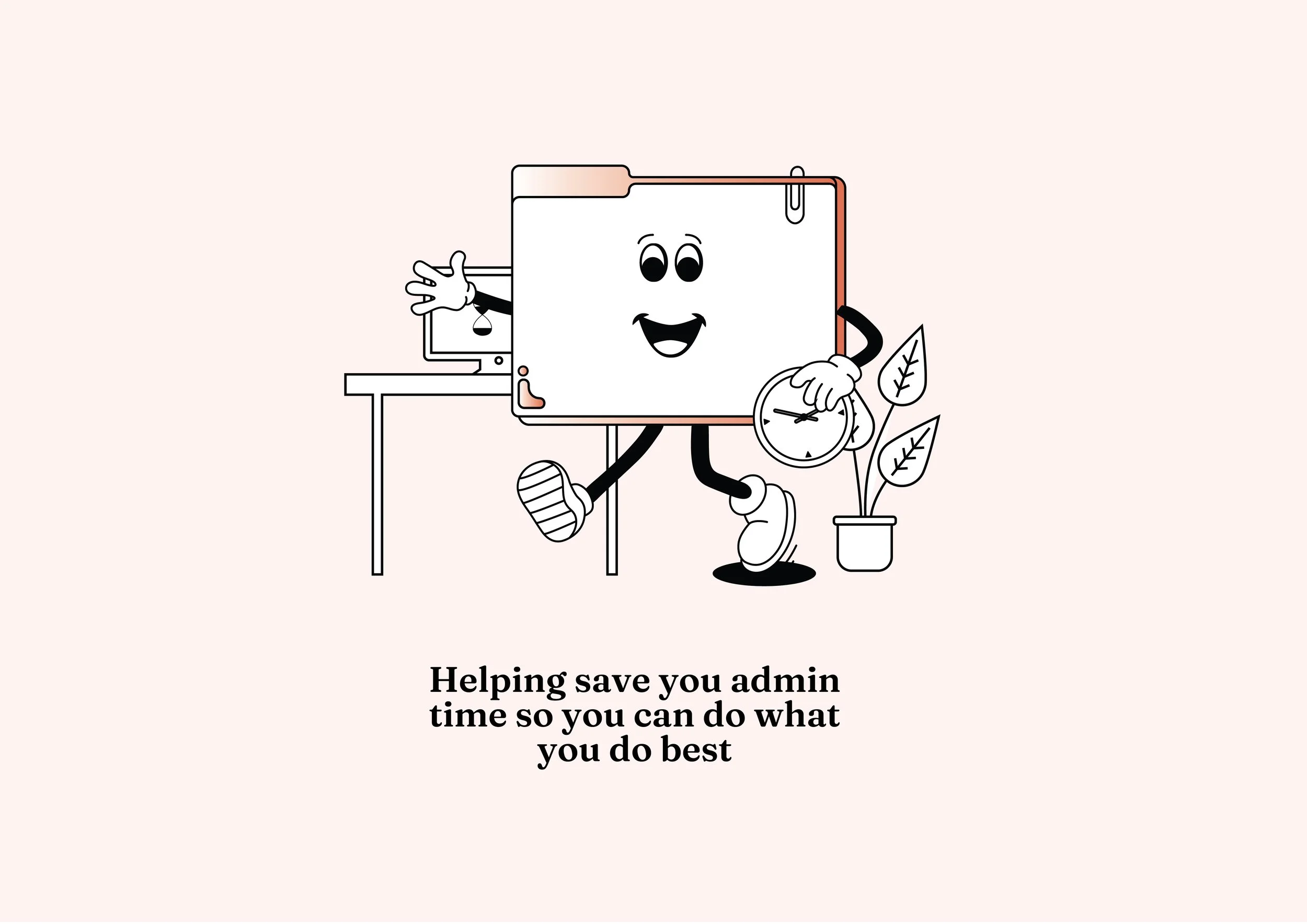
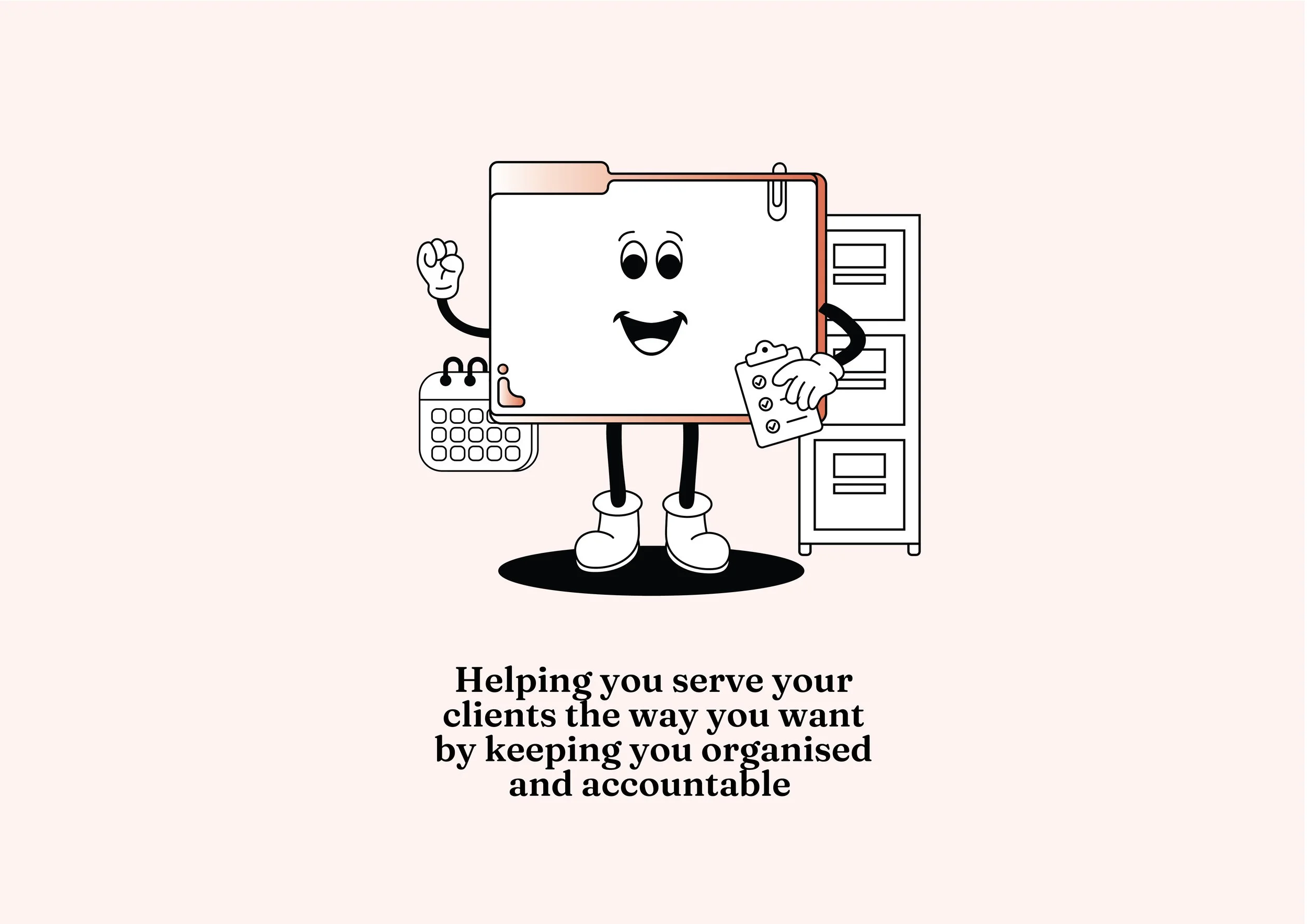
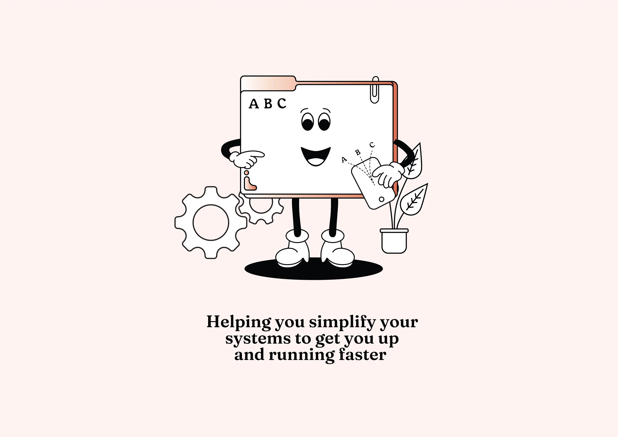
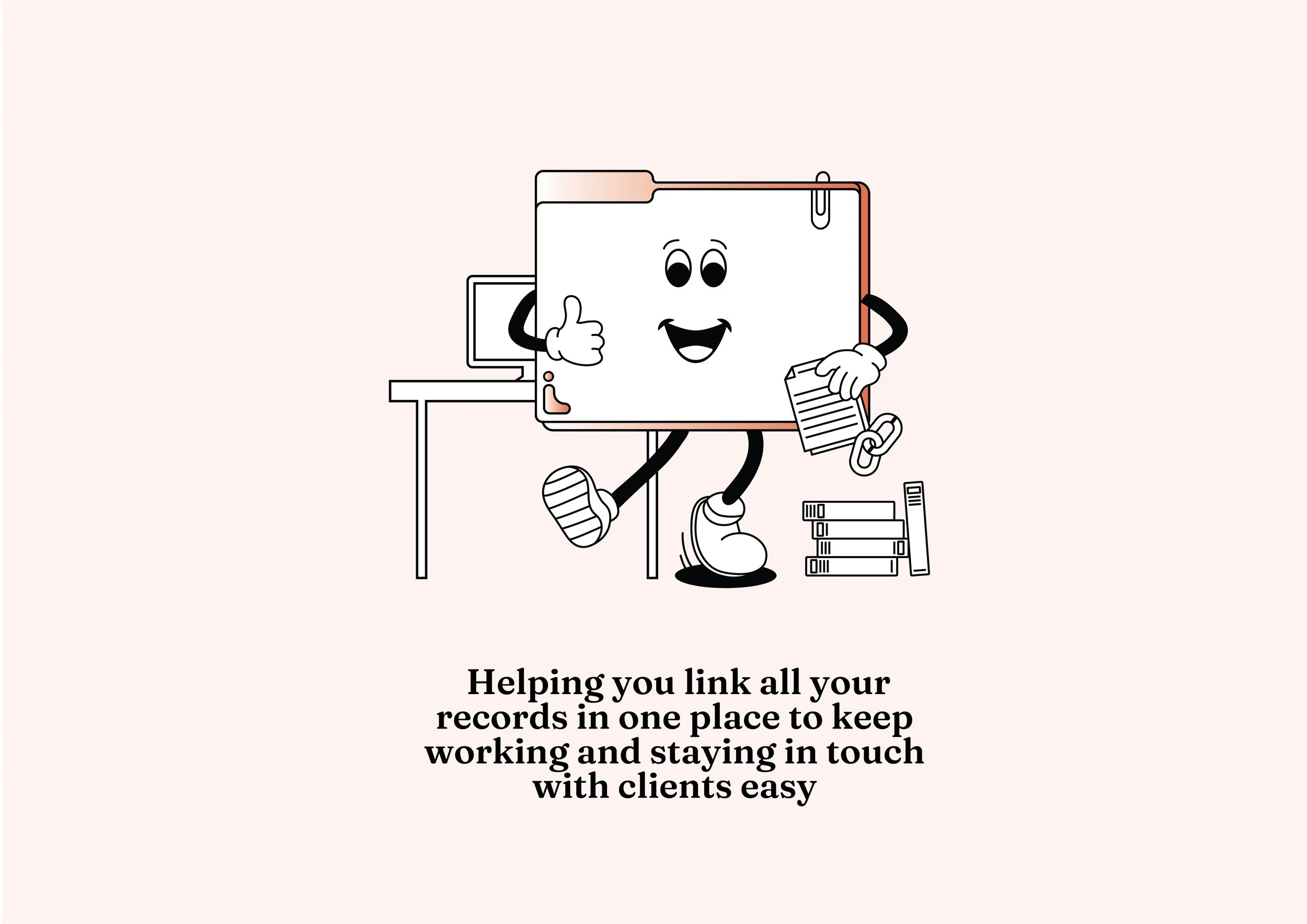
Alongside the brand I engaged the amazing Lacey Yeomans to help create the cool illustrations that you see throughout the brand. The illustrations were designed to reflect the simplifying of systems that Notemint provides. A manilla folder character was created and placed within a variety of locations and themes - all with a really nice retro vibe!